Brella’s event schedule
Project - Redesign an event schedule to support multi-track eventsProject Type - Product featureDuration - 6 months (2023)Role - Product Designer
Brella, the world's premier event platform, caters to virtual, physical, and hybrid events. Its unique AI-powered matchmaking algorithm aids attendees and exhibitors in achieving their business objectives at major events.
The event space has significantly digitalised over the past years, transitioning from in-person to virtual and hybrid events, and now returning to in-person.
At Brella, we have a proven track record of innovation. We noticed the absence of a customisable event schedule that supports multi-track events, which led us to create the first multi-track, customisable schedule in an event platform.
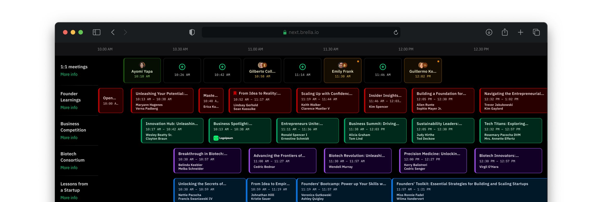
Understanding the requirement
Adapting to different use-cases
Most of Brella's clients host large, multi-day events with several tracks. This necessitates a schedule capable of managing such events. However, each event is unique, making it a primary challenge to create a one-size-fits-all solution.
Customisability
Event organisers employ diverse methods when creating their schedules. To accommodate this creativity, our schedule needed to be highly customisable.
Variables
Event schedules typically include various elements to organise and arrange content. We recognised that a good event schedule should offer flexibility, allowing event organisers to tailor it to their needs
Research
Industry situation
At that time, the event industry was rebounding from the impact of Covid and shifting from virtual or hybrid events back to in-person ones. Many large events were returning to their usual in-person formats, indicating a clear need for a mobile-first approach.
Mobile first
As event organisers are increasingly favouring in-person events, there's a clear need for attendees to have a comprehensive schedule. As such, our goal was to create the best possible experience on mobile devices.
Responsiveness
Although it functions on mobile devices, we found that the schedule also needs to support desktops and web browsers. A significant number of attendees often sign up using computers and initially view the content in desktop mode.
Inspiration
Since we are the pioneers in creating a multi-track schedule of this magnitude, there weren't many reference products available. But we gathered whatever we could find through the internet to see how others have executed this.
The F8 - Facebook Developer Conference app was a major source of inspiration. It showed how to effectively represent the event schedule at a high level while also providing detailed information.
Image extracted from Dribbble. A Shot by Dennis Kramer for Kersvers.
Design process
The F8 inspired layout
After iterating on several designs with a similar approach and conducting some prototype testing, we realised that this approach wasn't suitable for our use case. One of the main concerns was that when an event has many tracks, this layout made navigation cumbersome.
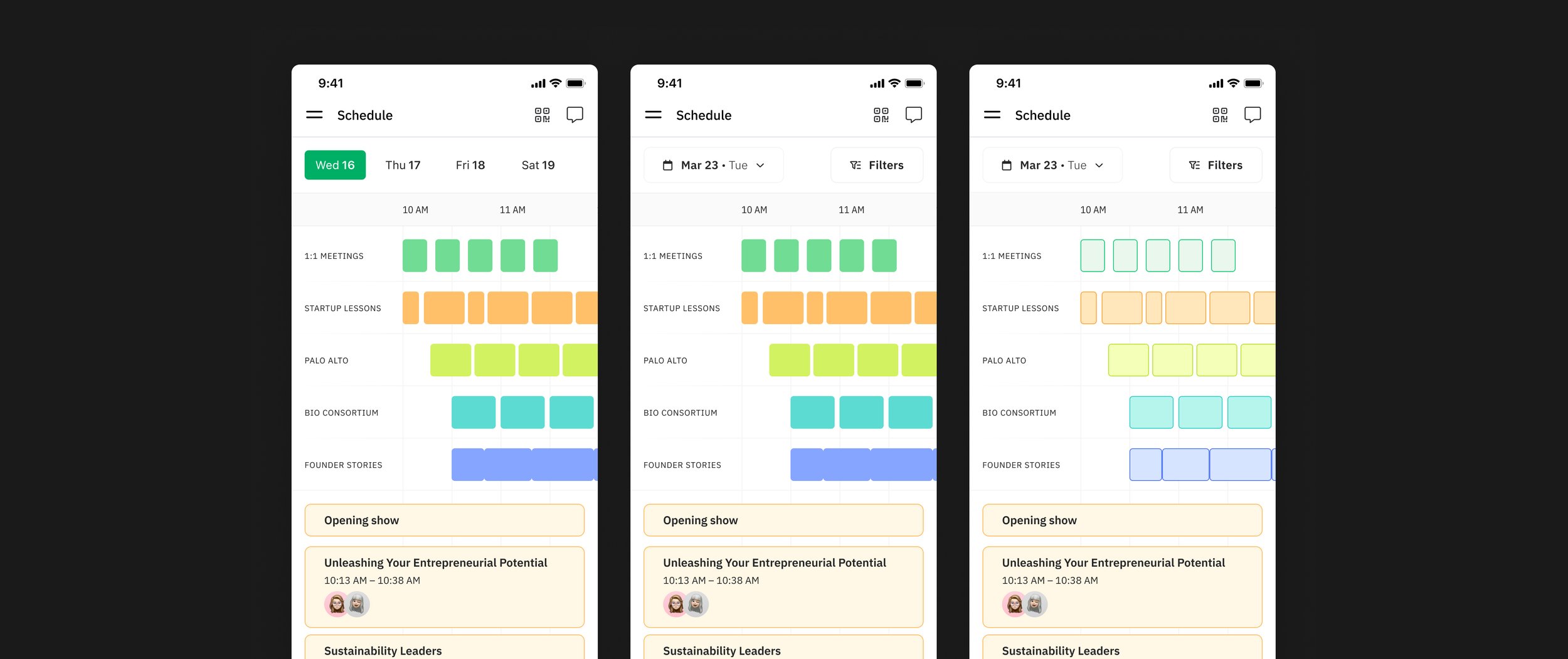
At a glance concept
In this concept, I tried to showcase as much as possible happening at the event. It was more of a zoomed-out schedule to show more sessions and tracks. However, this approach wasn't the best, as it was difficult for users to determine the details of the schedule.
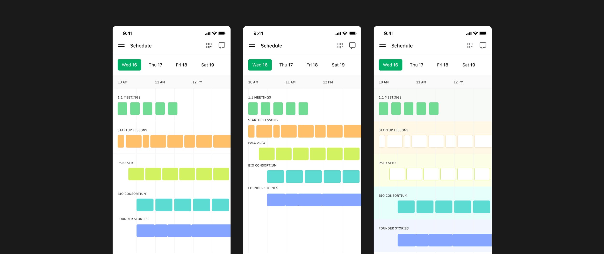
Final concept
In this version, I decided to take some parts from the previous concept and create a more readable schedule. I included bigger tiles with much larger text for the session titles.
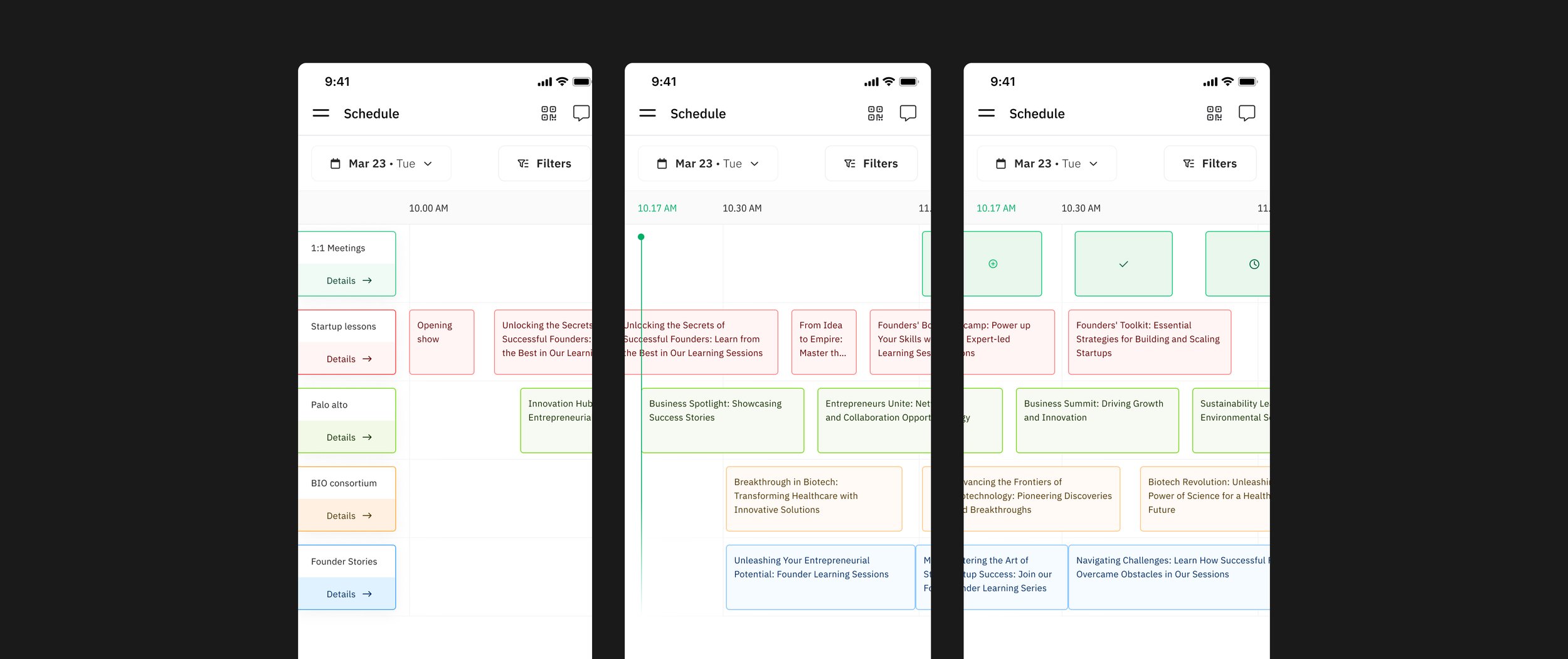
Iterations
After receiving positive feedback and insights from prototype testing, I started working on the solution. There were many iterations, but some highlights included adding more details in session titles and dynamic sizing.
The solution.
The solution was the first event schedule of its kind in the industry. What made it unique was the set of features we implemented. Notable items include:
A solution that adapts to various schedule types.
Customisation options for both the end user and event organiser.
Consistent experience on both mobile and desktop platforms.
Ability to embed as a widget on customer websites.
User experience
One of the most important elements in my design process was the user experience. Many event schedules I tried were frustrating and difficult to use. I didn't want that to happen with Brella's schedule. Here's how we improved it:
Accessibility: Ensuring small components and moving parts are user-friendly.
Information: Providing detailed information in an easy-to-read manner.
Micro animations: Adding simple animations to make the experience smooth.
Use of bottom sheets (drawers): Minimising confusion in navigation.
Customisability: Allowing the end user to tailor it to their preference.
Implementation
Designing this was just the first half of the show. Developing something that didn't exist, with little to no inspiration, was a challenging task for the developers. That made me do what I always enjoy: close collaboration with developers.
I stayed in close contact with the developers during this project to ensure we were on track. To make things easier, I created tokens for every element I designed and made components readily available for the developers on GitHub. This minimized errors and sped up the process.
To achieve this, I used Tokens Studio for Figma, a third-party tool that acts as a bridge between Figma and developers. It transforms what I design in Figma into design tokens and components for the developers to use.
We broke down the project into multiple iterations and conducted user testing between each iteration. We also decided what could be left out for the first release, which would come later as updates.
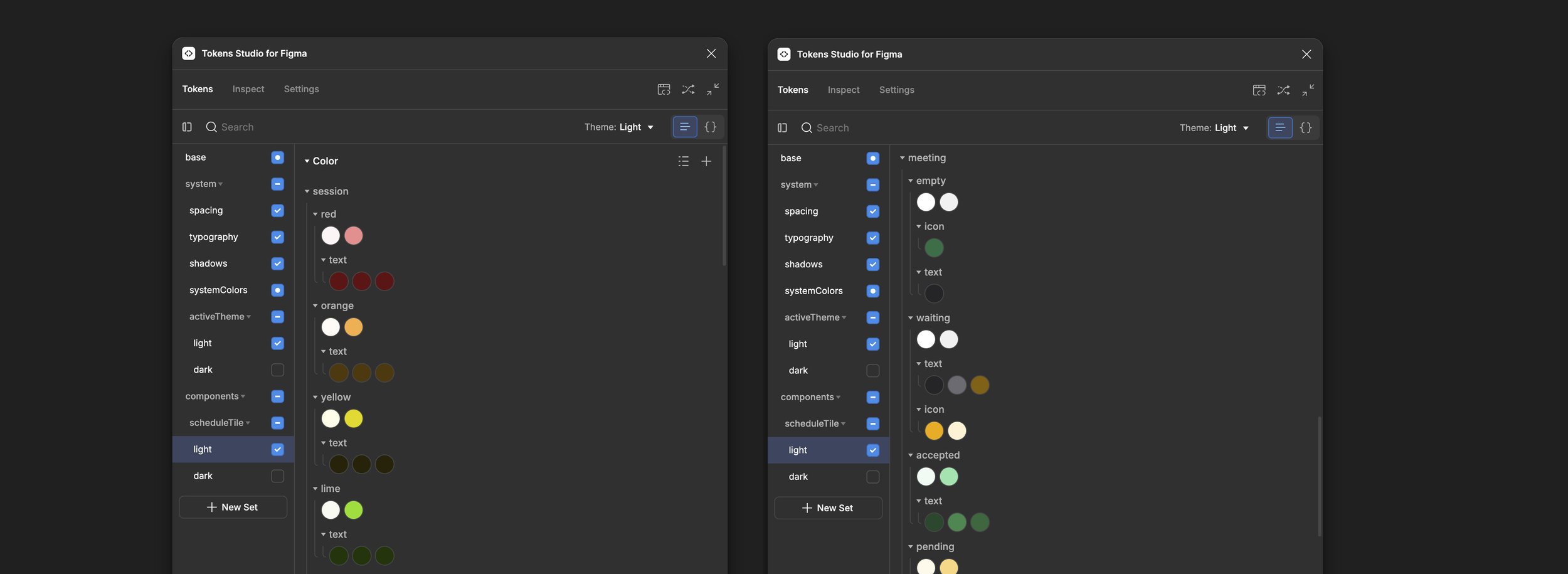
At each phase, we conducted extensive user testing with our internal team and demos with selected clients who had previously struggled with building their event schedules with Brella.
User Testing
Usability Testing
We conducted moderated and unmoderated testing to understand how users interact with the schedule.
A/B Testing
We tested a few different versions, differing in element sizing, animations, and performance.
Improvements
Among other minor improvements the most significant one was adding the “Linear view”. The schedule only had “Timeline view” before, which was a multi-track schedule arranged horizontally. During the user testing we realised that some users, especially the elderly folks tend to scroll vertically than horizontally. It was a rather new pattern for them.
After this finding, we decided to create a second view that is vertically arranged view that is similar to most calendar apps out there.
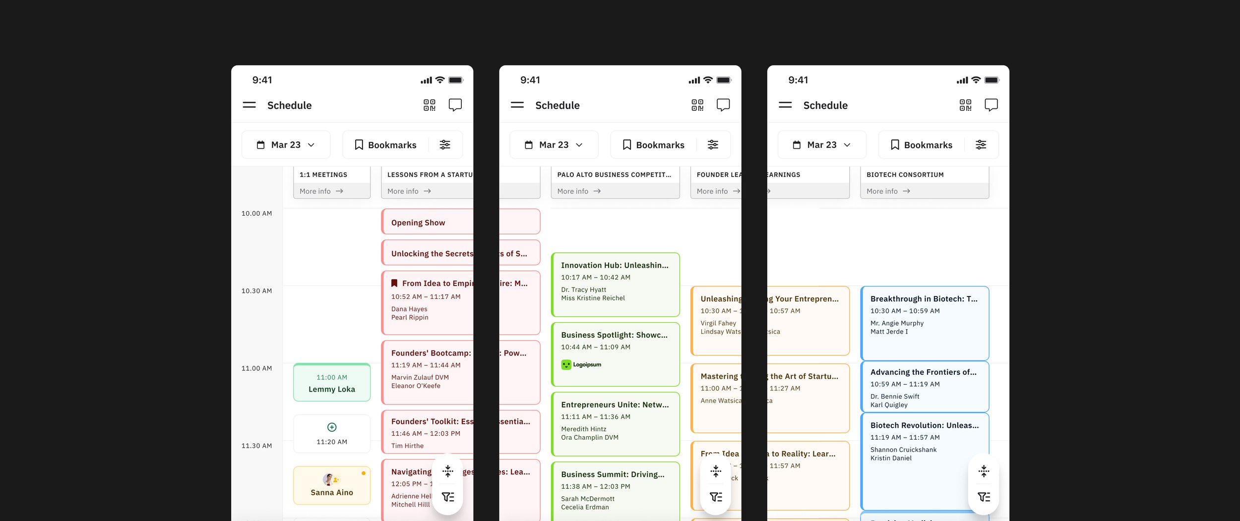
The newly built scheduled enabled Brella to tap into a new market segment while providing a better schedule for the existing client base.
Results
User engagement
User engagement was largely positive. Attendees appreciated the ability to quickly grasp the entire agenda, view upcoming meetings, and create new meetings directly from the schedule. They also found it easy to navigate between sessions, RSVP, and bookmark events of interest.
On the other hand, there were some negative opinions, mainly due to the absence of the old schedule. We found out that smaller events organisers prefer our previous schedule. Since these weren't Brella's target clientele, this wasn't our most pressing concern. Nevertheless, we decided to create a similar view that works with the structure and features of the new schedule we built.
Business impact
The main impact of this new feature was enabling us to confidently tap into a new market segment. Previously, the lack of a schedule capable of handling multiple tracks was one of the biggest deal-breakers in the large event segment. With this improvement, we were able to win those deals—especially in the US market, where numerous trade shows and larger events take place.
This project has been one of the most engaging and detailed I've undertaken. The schedule's redesign had a profound impact on Brella, as it was one of our most used and crucial features. Redesigning it presented significant challenges, given the high stakes, user expectations, and the project's gravity.
Conclusion
Reflection
One of the major lessons I learned from this project was how to handle an overwhelming amount of feedback. Due to the project's significance, the feedback process was extensive. I held frequent sessions with commercial teams, clients, and potential clients, all of whom provided an immense amount of input. Gathering all this feedback, evaluating it, and deciding what to consider and what to disregard was a wonderful learning experience.
Another key lesson was learning how to break down and develop a large project into manageable pieces. Rebuilding the schedule required many features to be included in the first version, making it challenging to divide into iterations. However, through collaboration with cross-functional teams, especially developers, I was able to determine appropriate milestones and deliverables.
All materials and content related to the Brella platform presented in this case study are the exclusive property of Brella. As the designer, I am showcasing this work solely to illustrate my design contributions. All rights, including intellectual property rights, are fully reserved by Brella Oy.
Inspiration images sourced from Dribbble remain the property of their respective owners, and all associated copyrights are fully reserved by them.
The screenshot from the Money20/20 website is the property of Money20/20 USA, and all copyrights are reserved by them.


